While they haven't changed much, and Cento hasn't changed at all, I finalized each of the typefaces. I wanted to make them all the same size. I also created a simplified version of Merida for cutting out as for small cut out versions the proper version would be too fiddly.
For the front of my brochures I tried various ways to place the Fedrigoni Logo on the side and the range typeface on the front. In the end I also added a subtle 'FRE' which is on the Freelife sample folder at the showroom and this created the right balance.

Because I wanted the Fedrigoni on the side of the brochure to fit with the theme of each range e.g.embossing I needed to create the appearance of the logo folded using scans as this would be almost impossible in reality and this is the result:

I went and created layouts for the information inside the brochure and used these also as part of the mail out booklets.
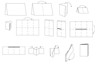
Also for the mail out booklets I created instructions for how to make up the booklet from the sheet of A4 on illustrator to be printed on the back of the envelopes they are mailed in.


No comments:
Post a Comment