Saturday 7 May 2011

Evaluation of Endangered Animals Project


Above are the final printed cards, showing some of the back designs and the checklists. Overall I am pretty happy with this project. I feel the major problem was that I strayed from my original idea which in the end helped with the final piece (the addition of the maps/infographics) but also meant I had less time to work on the imagery and printmaking.

I feel this project taught me that it is important to have a strong specific idea, even if its vague, to keep the work in check, my project started to lose its purpose because I moved away from 'the less there is of something the more treasured it is and should be'. Because I lost this direction my work lacked continuity and my choice of method, printmaking, lost its meaning.

Had I of had more time I would have liked to work more on the visuals for each card, looking at each animals movements and environments to make a more informed image. With more time I could have worked on more designs and more sets. I would also have liked to work on the printmaking techniques and spent more time doing roughs and tests rather than only being able to go straight to the final pieces.

I'm pleased with the posters, I like the colours and feel they are informative as well as decorative. However I could have probably made the meaning of the colours, sizes and numbers of each species more clear although I hope that together with the cards everything makes sense and that this creates a strong relationship between the two. I think the text I created works well on the cards but may be competing with the imagery on the posters. I also had an idea involving stickers which the audience could add onto the poster when they collected new cards which I didn't have time to explore.

Overall I'm happy with what I achieved in the time available but enjoyed this project to the extent that I wished I had more time to work on it. 

Final Prints and Cards

Below are my final prints for this project:


If I had of had more time to plan the prints and more time to experiment in the print room I  would have liked to try creating two lino blocks for the prints above, one of the black and one of the blue where I remove the parts I wanted to be white. I tired to get the effect with tissue paper, but I didn't like that these prints had a texture to them that the others didn't, it also took away some of the graphic aspect and I found it hard to get the placement and shape accurate. Instead I printed the two above and painted in the white sections with acrylic. I was pleased with this although you can see some of the paint texture and for larger print numbers this wouldn't be appropriate.


I was pleased with the other prints, I couldn't have the exact colours I worked out on photoshop because the paper wasn't available in these specific colours. However I am happy about this and ended up keeping the trading card colours closer to those of the prints than the colours I had previously planned.The final cards are shown below:


 I cleaned up the prints and brightened the colours, slightly edited them if I felt their needed to be more contrast or if the colours didn't look quite right. I then took the back of each card and made the background colour the same as the lightest colour in each card whether this was the background or line colour so the text was as readable as possible.

I also created checklists so the audience could keep track of what they have and what they need to collect, I had to ideas for this which are shown below but I decided to go with the second one:


For the one of the left I intended to have the check boxes as the shape of the animal but in the end decided to go for the more conventional square with a faded shape of the animal beside it as I felt this was clearer and I knew that with the butterfly checklist my initial idea wouldn't work.

Wednesday 4 May 2011

Poster Design and Back of Trading Cards

After designing the cards I started to work on the poster designs. I drew silhouettes of the species and then did an outline of the UK. I scanned these in and placed the silhouettes on the map. For common species I did up to 50 small icons whereas for the most endangered species I only placed one large icon on the map. I made each animal a different colour so they could be identified by shape and colour, the colours went from deep red to turquoise, from the most endangered to the least endangered. Below is the first draft of the mammal map:

I found the icons were too big and the piece looked too messy and overcrowded so I made the icons smaller:
I then did the same for birds:


I liked having quite large icons for the endangered species as they really stand out. I also found this map to be more systematic, I suppose is the best word, than the mammal map so yet again I tried to edit the mammal map:


I felt this map was an improvement, especially as I looked up different sources so I could include more animals in Ireland as it look very bare in the past maps.

The butterfly map was difficult because a lot of the more endangered species are in the south so spacing was difficult to handle. 


After this I wanted to plan the backs of the trading cards and created a template. The first template was too stiff and I decided to have the lines of text slightly follow the shape of the map. I wanted to include the icon so the card could be associated with the map. Since the maps are only vague depending on the spacing of other species and the number of each species, as well as not being optimum for finding a specific species, I decided to also include a map on the backs of the cards. As well as some general information for the interest of the audience. The information varies between birds, mammals and butterflies depending on what is appropriate and available.


I then wanted to work on the font. I felt that the stencil army fonts were very cliche and unsubtle but they were the sort of feel I was going for. Using this as a starting point I decided to use stencil letters to draw onto lino. I then cut into these lines to make my font. I scanned in this and inverted it to make the type black.


I was pleased with this font. I wanted the stencil feel because it has connotations of cutting and absence which works with the concept of species becoming extinct. I like the thinner letters in contrast to the army stencil type.

I tried a few compositions for the layout of the map, text and key and found the last of the three below to be the most successful and pleasing to the eye.


I then used the same composition for the other maps:


Finally I used the font for the backs of the trading cards, here is an example of the final Wildcat card:

Changing Idea - Developing Trading Card Designs

While developing the content for the booklet of infographics I found my ideas were better suited to a box with a selection of objects, such as cards, a poster, some stamps etc. However while then developing the idea for this I found it difficult to get a continuity across the items and when I thought more about it I found I had lost the concept that was driving this project: that the less there is of something the more it should and is cherished and treasured.

Due to this realization I went back to the print and trading card idea. I would design lino prints then use the images from these to make trading cards. However I didn't leave behind what I researched and developed for the book/box ideas. I decided that within the trading cards there would be sets such as mammals, birds and butterflies (just to start, more such as marine animals, amphibians would be added later) and the first purchase of one of these sets would come with a map showing all the animals in the set as well as informing the audience which are more endangered and approximately where they can be found in the UK. I would also have information about each species on the back of the card.

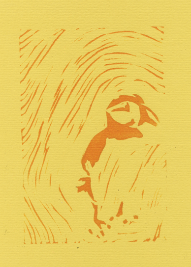
I did some sketches and traced over these to develop what I wanted the art of each card to look like. I wanted each set to have a different theme, for the birds I wanted to simplify the image as much as possible to make bold simple motifs. Below shows the magpie card, as magpie's are common I used green as the background colour. I feel the areas of white worked particularly well, they add a bit of contrast to the image. When I made the puffin card I instinctively made it smaller and off center and because I felt this worked well I did the same with the magpie card.


For the mammals I wanted to focus on texture,looking at the species fur, for the sake of the tests I just used the photos I took but edited the levels.


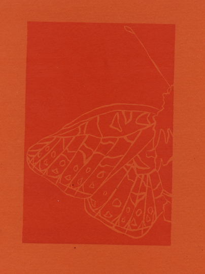
The butterfly cards would just be line drawings to emphasis their fragility. I tried a variety of ways to show the line drawings for the trading cards but none particularly stood out, although I felt the lines in black were the least effective.


 I was unsatisfied with the cards, I felt the colours were too garish next to each other and they weren't subtle enough. However I needed to use tones of red, amber and green to show which animals were endangered. I knew many trading cards have a border and tried to just have the colour as an outline of the card, shown below. However this still didn't work.


I then thought I would have stages of colours,not just three, for the different IUCN criteria. When looking up the criteria again I found this chart on wikipedia:


I decided to use the font colour as a guide for the line colour and the circle colour for the background colour. The tests of these are below.


 I was a lot more pleased with these than the previous cards. However felt these were too dull and decided to use similar colours but a bit brighter. I then also made another change. I wanted the cards that were Least Concern up to Vulnerable to have the line darker than the background so it shows the species to have a stronger presence. Then have Critically Endangered and Endangered species to have lines lighter than the background to show they are disappearing. Below is a colour chart showing the stages in changing the colours as well as examples of the new colours. The first colour is the background colour, the second is the line colour.


I found that with the white and red for Critically Endangered made the species stand out more rather than make it look like its fading away. However I liked this, it fits with my idea that the less there is of something the more it is treasured or in this case the more noticeable it is. Tigers, polar bears etc are more well known because they are endangered so I liked the idea that although the white line suggests the animal is losing is presence, the contrast with the dark background shows the attention on it.The amber and endangered species are at risk but because they aren't critically endangered they aren't paid as much attention to and thus fade slightly more into the background.

I made adjustments to the colours as I went along, below is where I found the greens to not be contrasting enough so I made the background lighter and the line darker.


 The magpie and puffin were difficult because they had three colours so I experimented with changing the colours of the three different sections. I kept the outline of the magpie black as having it turquoise wasn't very effective. However as the puffin has an amber status I made the line orange to show it isn't endangered but is still vulnerable.