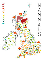
I found the icons were too big and the piece looked too messy and overcrowded so I made the icons smaller:
I then did the same for birds:
I liked having quite large icons for the endangered species as they really stand out. I also found this map to be more systematic, I suppose is the best word, than the mammal map so yet again I tried to edit the mammal map:
The butterfly map was difficult because a lot of the more endangered species are in the south so spacing was difficult to handle.
After this I wanted to plan the backs of the trading cards and created a template. The first template was too stiff and I decided to have the lines of text slightly follow the shape of the map. I wanted to include the icon so the card could be associated with the map. Since the maps are only vague depending on the spacing of other species and the number of each species, as well as not being optimum for finding a specific species, I decided to also include a map on the backs of the cards. As well as some general information for the interest of the audience. The information varies between birds, mammals and butterflies depending on what is appropriate and available.
I then wanted to work on the font. I felt that the stencil army fonts were very cliche and unsubtle but they were the sort of feel I was going for. Using this as a starting point I decided to use stencil letters to draw onto lino. I then cut into these lines to make my font. I scanned in this and inverted it to make the type black.
I was pleased with this font. I wanted the stencil feel because it has connotations of cutting and absence which works with the concept of species becoming extinct. I like the thinner letters in contrast to the army stencil type.
I tried a few compositions for the layout of the map, text and key and found the last of the three below to be the most successful and pleasing to the eye.
I then used the same composition for the other maps:
Finally I used the font for the backs of the trading cards, here is an example of the final Wildcat card:


No comments:
Post a Comment