
If I had of had more time to plan the prints and more time to experiment in the print room I would have liked to try creating two lino blocks for the prints above, one of the black and one of the blue where I remove the parts I wanted to be white. I tired to get the effect with tissue paper, but I didn't like that these prints had a texture to them that the others didn't, it also took away some of the graphic aspect and I found it hard to get the placement and shape accurate. Instead I printed the two above and painted in the white sections with acrylic. I was pleased with this although you can see some of the paint texture and for larger print numbers this wouldn't be appropriate.
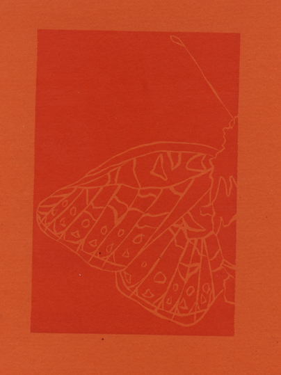


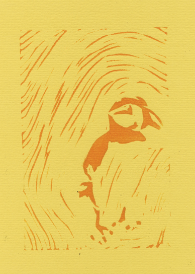
I was pleased with the other prints, I couldn't have the exact colours I worked out on photoshop because the paper wasn't available in these specific colours. However I am happy about this and ended up keeping the trading card colours closer to those of the prints than the colours I had previously planned.The final cards are shown below:


I cleaned up the prints and brightened the colours, slightly edited them if I felt their needed to be more contrast or if the colours didn't look quite right. I then took the back of each card and made the background colour the same as the lightest colour in each card whether this was the background or line colour so the text was as readable as possible.
I also created checklists so the audience could keep track of what they have and what they need to collect, I had to ideas for this which are shown below but I decided to go with the second one:


For the one of the left I intended to have the check boxes as the shape of the animal but in the end decided to go for the more conventional square with a faded shape of the animal beside it as I felt this was clearer and I knew that with the butterfly checklist my initial idea wouldn't work.
No comments:
Post a Comment