Due to this realization I went back to the print and trading card idea. I would design lino prints then use the images from these to make trading cards. However I didn't leave behind what I researched and developed for the book/box ideas. I decided that within the trading cards there would be sets such as mammals, birds and butterflies (just to start, more such as marine animals, amphibians would be added later) and the first purchase of one of these sets would come with a map showing all the animals in the set as well as informing the audience which are more endangered and approximately where they can be found in the UK. I would also have information about each species on the back of the card.
I did some sketches and traced over these to develop what I wanted the art of each card to look like. I wanted each set to have a different theme, for the birds I wanted to simplify the image as much as possible to make bold simple motifs. Below shows the magpie card, as magpie's are common I used green as the background colour. I feel the areas of white worked particularly well, they add a bit of contrast to the image. When I made the puffin card I instinctively made it smaller and off center and because I felt this worked well I did the same with the magpie card.
For the mammals I wanted to focus on texture,looking at the species fur, for the sake of the tests I just used the photos I took but edited the levels.
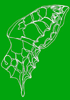
The butterfly cards would just be line drawings to emphasis their fragility. I tried a variety of ways to show the line drawings for the trading cards but none particularly stood out, although I felt the lines in black were the least effective.
I was unsatisfied with the cards, I felt the colours were too garish next to each other and they weren't subtle enough. However I needed to use tones of red, amber and green to show which animals were endangered. I knew many trading cards have a border and tried to just have the colour as an outline of the card, shown below. However this still didn't work.
I then thought I would have stages of colours,not just three, for the different IUCN criteria. When looking up the criteria again I found this chart on wikipedia:
I decided to use the font colour as a guide for the line colour and the circle colour for the background colour. The tests of these are below.
I was a lot more pleased with these than the previous cards. However felt these were too dull and decided to use similar colours but a bit brighter. I then also made another change. I wanted the cards that were Least Concern up to Vulnerable to have the line darker than the background so it shows the species to have a stronger presence. Then have Critically Endangered and Endangered species to have lines lighter than the background to show they are disappearing. Below is a colour chart showing the stages in changing the colours as well as examples of the new colours. The first colour is the background colour, the second is the line colour.
I found that with the white and red for Critically Endangered made the species stand out more rather than make it look like its fading away. However I liked this, it fits with my idea that the less there is of something the more it is treasured or in this case the more noticeable it is. Tigers, polar bears etc are more well known because they are endangered so I liked the idea that although the white line suggests the animal is losing is presence, the contrast with the dark background shows the attention on it.The amber and endangered species are at risk but because they aren't critically endangered they aren't paid as much attention to and thus fade slightly more into the background.
I made adjustments to the colours as I went along, below is where I found the greens to not be contrasting enough so I made the background lighter and the line darker.
The magpie and puffin were difficult because they had three colours so I experimented with changing the colours of the three different sections. I kept the outline of the magpie black as having it turquoise wasn't very effective. However as the puffin has an amber status I made the line orange to show it isn't endangered but is still vulnerable.


No comments:
Post a Comment