Monday, 14 March 2011

Website Design

Our newest project Online is about promoting ourselves, the first part of this was to design our ideal website:


I love scenery, sets and 3D work so I wanted to incorporate this in my design by having forests and cities made out of paper (crudely implied above) as well as mini figures of cakes since food often comes up in my projects. The birds are examples of my linocuts which I would want hanging down. I put these on a shelf to link to my love of collections. In the final website I would take better quality photos of objects on my shelves at home and Photoshop them in. I would also like to design my own pattern for the wallpaper. The words to the left would appear when you rolled over coinciding items on the bookshelf, the fonts relating to my new interest in decorative type especially those in books such as 'New Vintage Type'. In the final website the shelves will probably take up more space as these are what will change when you click the links. The title and top of bookshelf will be a banner and the words are the sidebar. 


Above is a rough idea of how the website works, how it links to this blog and a flickr account I have yet to make...The various pages are my 'portfolio' which will include my recent projects and a few fun things, a 'contact' section which will have my e-mail and twitter (when I get it), and a brief 'about' section giving people an idea of who I am and what I do. 

I'm hoping to redesign this blog sometime soon to fit with this look.  

This is a rough mock up of my website and as I get a better understanding of my practice and where my strengths lie this will change, I already feel as though there should be a more graphic element which started to surface in my Fedrigoni work. What I like about the basic idea is that I can change the objects on the shelf depending on my current interests and work.

Tuesday, 8 March 2011

Fedrigoni Brief YCN - Evaluation

I haven't put up the final spreads that I am sending to the YCN as I'm not sure whether that is allowed.

I have mixed feelings about this brief. I worked hard on it and in some ways I am happy with the outcome. It answers the brief in that it works across various channels: mail, web and magazines. It works for three different audiences: already loyal customers unaware of the range (the brochures), customers Fedrigoni specifically wishes to have (mail outs) and a wider audience (web adverts and magazine inserts). I enjoyed working with and am pleased with the typefaces especially as I was able to link them to paper processes which allows Fedrigoni to show off the versatility of their papers while also informing the audience of the background and cultural influence behind the papers.

However I also feel when looking at all the research into paper art that I conducted that this project could have been more creative and exciting. The outcome feels very corporate and not what I expect my work to be, although I do often feel a graphic influence coming into my work.

On a more practical side I would have liked to work on the animations more. The Vellum and Kendo animations are very subtle and I would have liked to experiment with lighting to make them clearer.

I really enjoyed exploring the cultural backgrounds of the papers, and feel this is something to remember for future projects. However I also feel that I should have put a bit more emphasis on the environmental aspects as well, since this is what Fedrigoni focuses on with this range. 

Monday, 7 March 2011

Fedrigoni Brief YCN - Final Adjustments

While they haven't changed much, and Cento hasn't changed at all, I finalized each of the typefaces. I wanted to make them all the same size. I also created a simplified version of Merida for cutting out as for small cut out versions the proper version would be too fiddly.


For the front of my brochures I tried various ways to place the Fedrigoni Logo on the side and the range typeface on the front. In the end I also added a subtle 'FRE' which is on the Freelife sample folder at the showroom and this created the right balance.


Because I wanted the Fedrigoni on the side of the brochure to fit with the theme of each range e.g.embossing I needed to create the appearance of the logo folded using scans as this would be almost impossible in reality and this is the result:


I went and created layouts for the information inside the brochure and used these also as part of the mail out booklets.

Also for the mail out booklets I created instructions for how to make up the booklet from the sheet of A4 on illustrator to be printed on the back of the envelopes they are mailed in.

Fedrigoni Brief YCN - Development

After creating the typefaces I needed a way to apply them to a marketing campaign. I decided to apply each typeface to paper in a different way. Kendo would obviously be folded, Cento printed, I would cut out the Merida typeface and emboss the Vellum one. I would create sends outs, brochures and Web adverts. For the web adverts I wanted to do simple stop motion films of the typefaces being created using the methods mentioned above. I thought this would bring the physicality of the paper to a flat medium and the stop motion would ad a handmade feel.

This is the first attempt at the Kendo web advert, apologises they are all very low res:


Here's the first drafts of the 3 as well as a second attempt at Kendo:


Fedrigoni Brief YCN - Cento

Cento is a poem made up of already existing poems which relates to the Cento paper being made of recycled materials. I struggled the most with this idea as it didn't have a strong visual cultural image as its more of a concept. My initial attempt was to take scans of old poety, music and books to create the text which resulted in this:


I also tried to make the word out of famous poetry lines which created this which wasn't very successful:

I was then inspired by the 'Reverting to Type' exhibition which showcased letterpress work such as those below. Letterpress is the use of created letters to make various pieces which works with the idea of recycling and making new things out of already existing items.


To take my research further and to find more interesting uses of letterpress I researched futurist typography and came across the inspiring 'Futurist Typography and the Liberated Text' by Alan Bartram images from which are shown below:


These were the inspiration for the piece below, which I also printed using monoprinting.

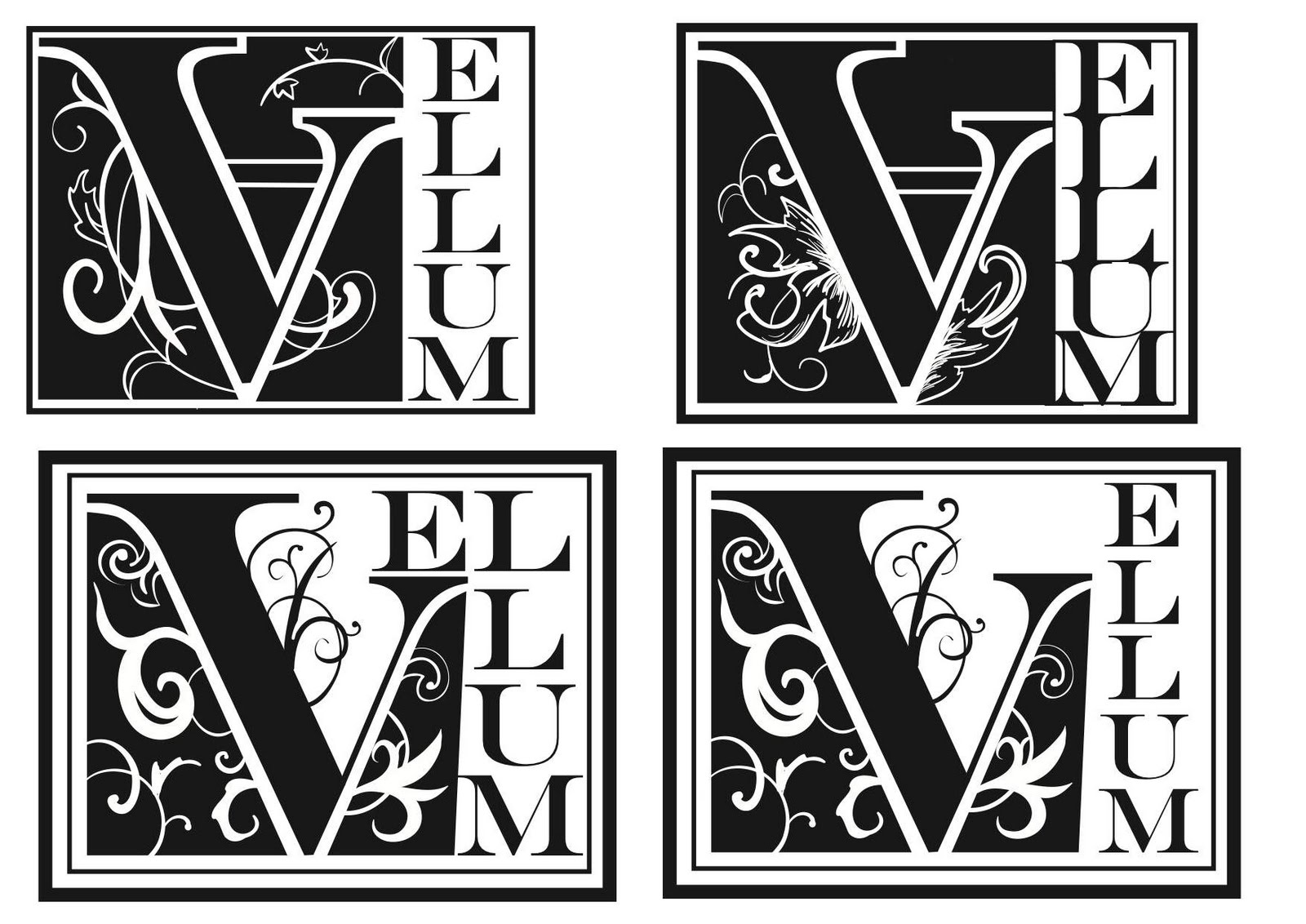
Fedrigoni Brief YCN - Vellum Typeface

Vellum is the paper from from animal skin which were used for illuminated manuscripts so this was the inspiration for my typeface. I looked at various books on Illuminated manuscripts and decorative text such as 'The Decorated Letter' by J.J.G. Alexander which the following example is from:


Also 'Decorative Alphabets and Initials' edited by Alexander Nesbitt which was amazing for seeing different decorative elements I could potentially use:


From these I developed the following designs:

Fedrigoni Brief YCN - Typefaces

I liked the idea of creating typefaces for the 4 lines within the Freelife range. I had already begun with Merida and decided to work on getting ideas and concepts for the other 3. The idea is quite similar to another piece of Fedrigoni marketing. This design from the Paper Graphics website can be used as shown but also each letter can be separated and used on a postcard to be placed on Magazines or sent out.


I looked at the line Kendo, the line itself is made using hemp fibers and the title refers to the Japanese Martial Arts style. The link is that the Japanese use hemp fibers in making paper as well as kimono. Hemp is also used in Japanese kimono patterns. Based on this I explored these patterns and looked through Kimono Books. I was thinking of involving the patterns in my typeface or having a kimono pattern to accompany it as part of the identity. I looked at books such as 'The Story of the Kimono' by Jill Liddel which the images below are from:


I was also trying calligraphy to create the letters as this fits with Japanese culture. There is also origami which I though was the most appropriate as it involves paper. I tried to make letters by folding paper and after a few attempts came up with this style of writing which I recreated in illustrator: