Showing posts with label Own Work. Show all posts

Sunday, 20 March 2011

Japanese Earthquake Zine - Final Spreads

 These are the final spreads of my zine. I originally did my zine on a black and white photocopier but it made everything much harder to make out so I did a colour version instead. These are the front covers of both as well as a spread showing the back and front spread.


 I then went to some establishing shots, I tried to show 3 of the main areas I edited, dividing the page up in thirds as I didn't want a page for every scene. I then took the images of the reverberations and showed two stages of the shaking starting and getting worse. I didn't split the page evenly to give a more chaotic feel.


 I then showed the groceries flying everywhere and the shaking stairs which then leads to a double page spread of the crack going up the stairs.


 I put the collages of the street in a wreck and the church crumbling together and then lead to the most chaotic images of the fires and floods. I wanted the most expressive pieces to be towards the end.


 In the black and white version of my zine this piece was the final page before the gravestone as I wanted a bit of calm, just showing the water in the city. However in the crit it was said that it was hard to make out what was happening in this image so I removed it for the colour version.


I'm hoping the colour version is clearer, if it isn't another idea I had was to put quotes from newspapers but I wanted to avoid this as I wanted the audience to reflect on the images without text. One idea might be to put a page at the front with quotes and then go into the images, maybe having the scenes of calm before this.I feel I should have also focused on a clearer narrative and more noticeable stages, I started to show graduation from calm to the shaking, destruction, the fire and flooding and finally the gravestone but I could have made these stages clearer. I could also have considered the use of different media as I think using oil pastel towards the end was effective and I think I should have worked on slowly changing how much I edited and what I edited with. I was hoping the title of 8.9 was clear enough, which may be the case this close to the incident but when there's been a greater gap including the word 'magnitude' might help. 

Monday, 7 March 2011

Fedrigoni Brief YCN - Development

After creating the typefaces I needed a way to apply them to a marketing campaign. I decided to apply each typeface to paper in a different way. Kendo would obviously be folded, Cento printed, I would cut out the Merida typeface and emboss the Vellum one. I would create sends outs, brochures and Web adverts. For the web adverts I wanted to do simple stop motion films of the typefaces being created using the methods mentioned above. I thought this would bring the physicality of the paper to a flat medium and the stop motion would ad a handmade feel.

This is the first attempt at the Kendo web advert, apologises they are all very low res:


Here's the first drafts of the 3 as well as a second attempt at Kendo:


Fedrigoni Brief YCN - Cento

Cento is a poem made up of already existing poems which relates to the Cento paper being made of recycled materials. I struggled the most with this idea as it didn't have a strong visual cultural image as its more of a concept. My initial attempt was to take scans of old poety, music and books to create the text which resulted in this:


I also tried to make the word out of famous poetry lines which created this which wasn't very successful:

I was then inspired by the 'Reverting to Type' exhibition which showcased letterpress work such as those below. Letterpress is the use of created letters to make various pieces which works with the idea of recycling and making new things out of already existing items.


To take my research further and to find more interesting uses of letterpress I researched futurist typography and came across the inspiring 'Futurist Typography and the Liberated Text' by Alan Bartram images from which are shown below:


These were the inspiration for the piece below, which I also printed using monoprinting.

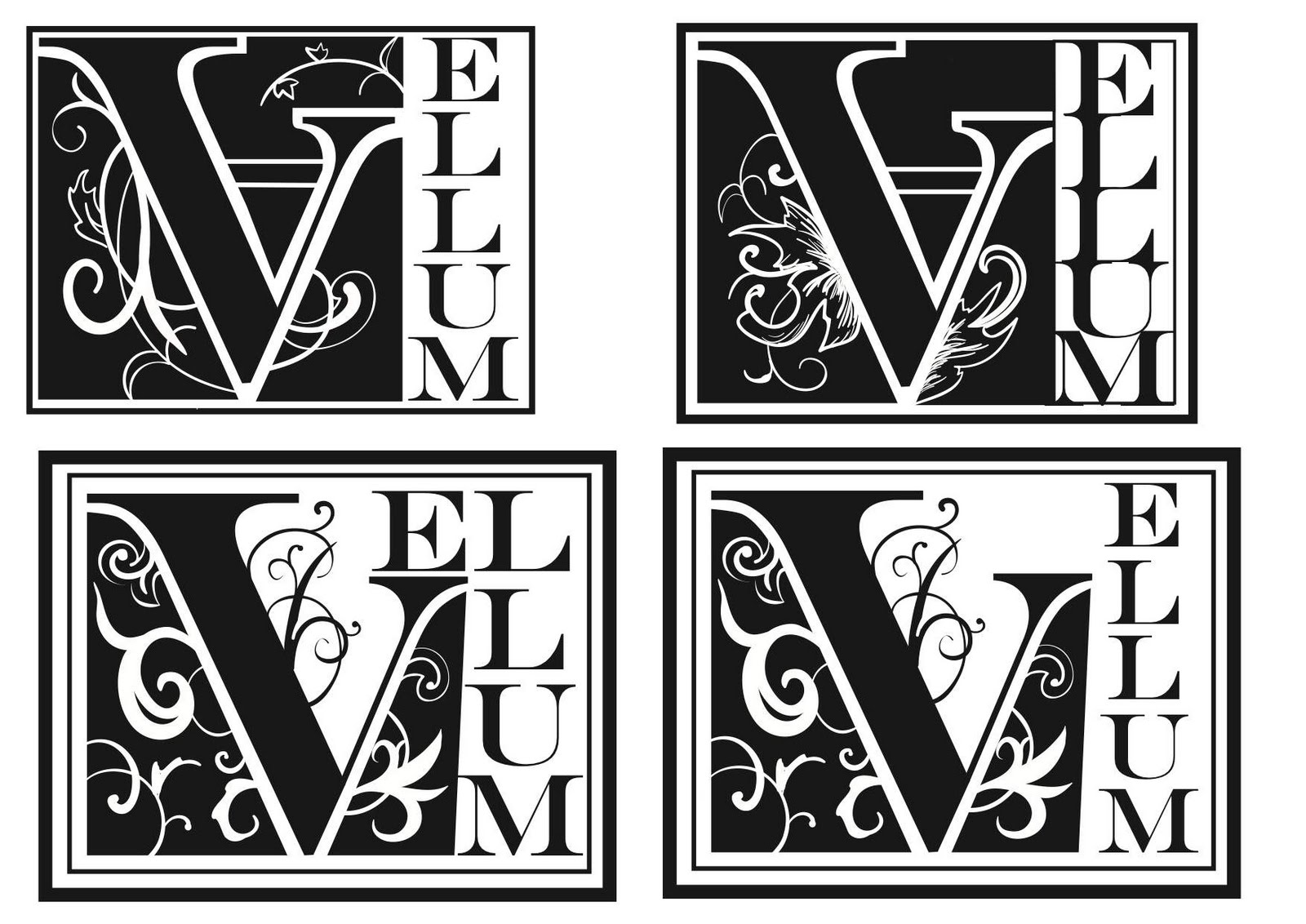
Fedrigoni Brief YCN - Vellum Typeface

Vellum is the paper from from animal skin which were used for illuminated manuscripts so this was the inspiration for my typeface. I looked at various books on Illuminated manuscripts and decorative text such as 'The Decorated Letter' by J.J.G. Alexander which the following example is from:


Also 'Decorative Alphabets and Initials' edited by Alexander Nesbitt which was amazing for seeing different decorative elements I could potentially use:


From these I developed the following designs:

Fedrigoni Brief YCN - Typefaces

I liked the idea of creating typefaces for the 4 lines within the Freelife range. I had already begun with Merida and decided to work on getting ideas and concepts for the other 3. The idea is quite similar to another piece of Fedrigoni marketing. This design from the Paper Graphics website can be used as shown but also each letter can be separated and used on a postcard to be placed on Magazines or sent out.


I looked at the line Kendo, the line itself is made using hemp fibers and the title refers to the Japanese Martial Arts style. The link is that the Japanese use hemp fibers in making paper as well as kimono. Hemp is also used in Japanese kimono patterns. Based on this I explored these patterns and looked through Kimono Books. I was thinking of involving the patterns in my typeface or having a kimono pattern to accompany it as part of the identity. I looked at books such as 'The Story of the Kimono' by Jill Liddel which the images below are from:


I was also trying calligraphy to create the letters as this fits with Japanese culture. There is also origami which I though was the most appropriate as it involves paper. I tried to make letters by folding paper and after a few attempts came up with this style of writing which I recreated in illustrator:

Fedrigoni Brief YCN - Merida Research

In order to research the Merida line within the Freelife range I went to the British Museum to see their Mayan/Aztec section. Of the Mayan/Aztec culture I was particularly interested in the calendar, the writing system and the day of the dead. Here's some photos I took with the awful camera on my phone:


I then started to experiment with the different aspects I was interested in. I was thinking of trying to create an environment out of paper to make an event at this point. I wanted it to relate to the environmental aspect of the Freelife range as well as using Mayan flowers to relate to the Merida range. I looked at this website for information on Mayan plantlife:

http://www.yucatanadventure.com.mx/yucatan-flora.htm

I then created an invitation to the event based on the Mayan calendar, the piece would be cut into sections and could be put together as a puzzle. I got this idea from the puzzle that Fedrigoni released as pictured in the post below.


I also wanted to create a font based on the Mayan writing system and here's my try at the FRE of Freelife:

I then refined this and created the word Merida using the colours of the range: