The piece above is some infographics about Endangered species around the world but its an example of one way of going about representing information. There is also a selection of stamps of British endangered species at this link.
In the book 'Information Design Workbook' by Kim Baer I found the following examples:
Above are two images by Nigel Holmes. I thought the first one packed a lot of information into one page and showed the information in a variety of ways. The monotone look of the piece is successful and may work well for me as the colour red (in relation to the IUCN Red List) is very important. The second piece is a simple but easy to take in way of showing numbers of things in a visual form. The repetition of images to show numbers is probably going to be a large part of my piece.
The first piece below is on this website, it shows the frequency of certain words in the 5 holy books of the worlds major religions. While the one next to it is here and it shows the differences in frequency of changes made to wikipedia articles which give the impression of which ones are updates more regularly or which ones are an area of debate. Both these are less easy to read instantly but can involve the viewer for longer amounts of time in most cases.
Then there are these pieces from Chris Jordan's 'Running the Numbers' which explores American culture using statistics. The first piece is Seurat's famous image shown with the number of cans used in the US every 30 seconds. The second is 2 million plastic bottles, the number used in the US every 5 minutes. These give a strong sense of the scale of the statistics at the point when the numbers become meaningless.
I then looked at the book 'The Power of Paper in Graphic Design' by Catharine Fishel for some examples of tactile elements I could add to the book.
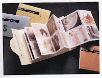
Although I'm not doing trading cards anymore I thought there is always the option to add some cards to the book, in a small pocket or ones that could be ripped out. A nice example of cards is the piece above by Cheryl Kubo, I like the use of bright colours and the vibrance of them. Next to this is a piece by Templin Brink Design which is a small book of stamp cut examples of work. I liked the stamp idea, especially making one large stamp of an endangered species and working in the same area making more but smaller stamps of more common species.
The piece above by Wagner Design made me consider using windows and cut outs as well as pull outs in my book. While the piece next to it by design firm Wink made me consider cutting pages into the shape of the British Isles or certain animals.
The two pieces by Stefan Sagmeister (left) and Salvato, Coe + Gabor (right) made me continue to consider using cut outs in my book, especially as it emphasizes the idea that endangered or extinct means the animal will no longer be there. I like that Sagmeister's piece had the cut out going all the way through the book and this emphasizes the idea of unavailability.
Finally I looked at the book 'The Best Informational Diagrams' published by P I E Books.
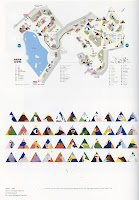
The first piece is by design firm Grundy and Northedge. I like the energy the images add to this piece, it makes you much more interested in the statistics. The images and the text work together instead of either one doing all the work. The piece next to it is another piece by Nigel Holmes, I feel I could use this piece as inspiration to create a map made of animals in the UK, with numbers coinciding with their vulnerability.
The last piece is by Eriko Hasumi, which relates strongly to my work as it involves animals. It's interesting to see one way of simply representing animals in order to make them part of a piece of infographics.


