Monday, 29 November 2010

New Project - Stupidly Long Post about how I couldn't make up my mind what to do

In our main module are new project is to illustrate a quote and I've chosen:

"Nothing of me is original. I am the combined effort of everybody I've ever known" - Chuck Palahniuk

Had a crazy day of ideas and research where I really struggled to find where I wanted to go with this in the time we have, its hard to adjust to a week and a half project after however many weeks our last was.

I wanted to represent the idea that we are all made of the same/similar/overlapping building blocks which can make a variety of people. Looking at books, music, film, people, country. All the things which can affect who we are.

One of my first ideas was to look at lego, ad how these simple building blocks can create so many things, I found inspiration like this:


and the work of Christoph Niemann who uses lego to illustrate parts of New York life:

http://www.christophniemann.com/

But I couldn't find anywhere that sold just a basic box of lego, the good old days are gone, and wouldn't have enough time to order from the internet. So scrapped that idea.

Then I was thinking of figure designs and the idea of personalizing blank figures with either stickers or aspects you could stick on, similar to this piece by Frank Kozik:
I was then inspired by a piece by Neil Parkinson:
Weirdly this piece gave me the idea to have a very simple figure which a hollow inside and a perpex sheet at the front and you can fill it will small items indicating your personality from a selection of pieces, obviously some people would have similar things which is how it relates to the quote. But then a lot of what I wanted people to put inside seemed very 2D like miniture CD's and national flags etc. so I skipped that idea.

Sticking along those lines I thought of doing a figure that you could fill with stickers of things personal to you a similar style to these pieces by Tom Pearson and Miika Kumpulainen:

But I wasn't sure I was interested in the designing the stickers so kept this idea in case I couldn't make up my mind.

Another idea was to have colours attributed to music, books etc and have people make their own colour by combining the colours of all the things they liked, but I had NO IDEA how to make that work, some superior knowledge of computers than I have. But this was inspired by an artists from my last project Tattfoo who attributed colour squares to fruit/veg to encourage people to eat a range of colours of fruit/veg each day.

Finally I liked the idea of taking a set of simples images (at the time I was thinking basic shapes) and making a story out of these shapes so that the whole thing was made of these same building blocks so none of it was made differently/originally but in each case they make something new. This changed to me using letters from the quote (at the moment thinking of only using the letters from 'nothing' so I don't have too much to work with) inspired by this small book I was shown last week from Brighten the Corners which uses letters to make images:

I also decided not to do a story as you would pay more attention to the story than the quote so thought I would do a cityscape, showing a place with people who are all 'not original'. Here's an initial experiment doing this, unfinished:


This post was ridiculous, sorry...

Printmaking


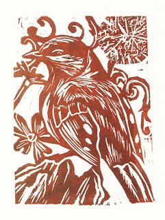
Here's the print I did last week. This week I was working on the pieces for my new idea. I cut two lino's and printed them about 4/5 times each trying to experiment with gradients and colours, I struggled to get bold colour without it coming out almost black especially with purple. I'm pleased with the lino's themselves. I spent all day Tuesday in the print room and cut 3 more pieces of lino at home over the week.

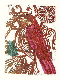
I scanned in the image above and printed it on a variety of colours. I edited the colours of the print itself on photoshop so if need be I can do this for the final piece. I was going to use different coloured backgrounds but I might save that for the climax and keep both the ink and paper colour to more beige/brown tones so the climax really stands out.

Competence in practical printmaking techniques: 60 (pleased with lino's just struggling with colour)

Thoughtful and imaginative use of printmaking: 65 (considering the colours of my piece and what I will be printing onto)

Visual Sensibility; understanding and expressing ideas in images: 65 (making what I have already planned out)

Using research to expand knowledge, enrich thinking and affect your work: 65 (still using inspiration for last week)


Active participation in taught sessions: 55

Monday, 22 November 2010

Printmaking Stuff

We had a visit from Katherina Manolessou this week who had an amazing collection of books which really inspired me and she also helped me improve my approach to my book.

Firstly there was a book which works as a poster, it starts on one side with a sequential piece and then you turn over to reveal a poster. I really liked the idea of incorporating posters into books. Although I didn't get a photograph of it there was a book in which one of the pages folded out to be bigger like a poster.


Another book I really liked was one looking at love hearts and it used stickers which the audience could place so it had an interactive element. It also showed a range of well applied compositions. It was nice to see the roughs that went towards the creation of this book.


There was also a small book with a style similar to how I want to do and it had a way of doing the cover I hadn't seen before but really liked as its simple but pretty effective. Its similar to a warp around:


I talked to Katherina about my work and realised that my compositions don't vary much, because of this I make another mock up of my book and played more with fold out pages, inspired from the books I saw, to emphasis certain points and I used some more close ups and considered using silhouette more. I feel I made some very important changes to my book plan this week. I also did a print of a lino I cut during the week which I was pleased with and will upload a scan of when it's dry.

I made several copies of one print this week and spent a day in the printroom.

Assessing Myself:

Competence in practical printmaking techniques: 65 (was very pleased with the print I did this week, the gradient technique is working well and I was happy with the lino I cut)

Thoughtful and imaginative use of printmaking: 55 (more thoughtful towards the format of the book rather than printmaking at the moment so not sure if that counts)

Visual Sensibility; understanding and expressing ideas in images: 75 (really improved how my book works with my idea and using it as an object, considered composition and viewpoint a lot more)

Using research to expand knowledge, enrich thinking and affect your work: 80 (the books Katherina brought in really helped in the transition of my idea)


Active participation in taught sessions: 75
(discussed my work with both Caroline and Katherina and took part in looking at books)


Food Illustration Final Pieces

I definitely think the weak point in this project was I didn't allow enough time to properly consider how I wanted to present my images, I have a lot of options: posters, greetings cards, a book or collection of small books, a cake box with prints inside. In the end with the time remaining I decided to do greetings cards but I tried to add a little extra by putting the recipes for the food inside the card. At first I tried this with paper but found that tracing paper looks a lot more successful.

Here's pictures of the cards and an example of how the inside looks:


The other final pieces I create are two posters, they are advertising Fairy Tale Ballets/Opera's showing at the Royal Opera House, Cinderella is on now while Hansel and Gretel was last year. I'm really happy with these, I was quite worried about it since I hate working with text but I found one that worked and I used it with the greetings cards.

Snow Queen

For Snow Queen I wanted to create a castle out of a Danish Tower of Cake called a Kransekake as the Snow Queen's palace. I also wanted some cookies surrounding it with snowflakes drawn on them and I also wanted to try suspending some in the air.

Firstly I wanted to look at snowflakes and I found the work of Wilson Bentley who was the first known person to photograph snowflakes. Here's some examples:


I then made the butter cookies and decorated them based on these photographs:


After this I made the Kransekake, this slideshow also shows the making of the metal frame which I used to hold some of the cookies in the air:
And here's the results:

Monday, 15 November 2010

Print Work So Far

I finally scanned the prints I've done so far, so without further ado, tada!

My first attempts at lino:


And then later pieces working on the style and colour of my piece.


Beauty and the Beast Completed

I managed to successfully make macaroons! Hurray! Never ever making them again.


Then I was able to go on to making the Moelleux au Chocolat which was so much easier and such a relief after the macaroons.

It was dark when I finished and I wanted this piece to be light and bright so I waited until the next day and then I decorated my Creme Caramel with a portrait of a lady, which took a few attempts as originally I was going to use piped chocolate but the colour didn't stand out and I couldn't get very detailed, so I tried the white chocolate writing icing I got for the gingerbread house and that worked really well except it spread out over time so I had to photograph it quickly and re draw it 3 times. I baked my Moelleux au Chocolate and then set up for the photograph. I wanted a high view point which meant getting my tripod as tall as possible which was pretty funny as I had to stand on a chair to see the photos.

Here's the results:


I'm really happy with the difference between the desserts when viewed from above and from the side.

Print Progress

Haven't had any updates on print lately. Not this week but the week before I was ill so wasn't able to work on the project. This week had my crit with Caroline and decided to start cutting my final pages so I could have more time to experiment with colours and bookmaking. Because I've just been cutting my lino I haven't made any prints and only spent a few hours in the printroom. Because of the deadline coming up I've only managed to cut one of the five pages, but I'm hoping to catch up over the next two weeks starting tonight.

Because of this I haven't been working on my printmaking skills but have been considering textures and markmaking in my lino's and finalising my compositions. I also did some research at a Small Publishers Fair (see earlier post)

Assessing Myself:

Competence in practical printmaking techniques: 0 (haven't done any prints)

Thoughtful and imaginative use of printmaking: 0

Visual Sensibility; understanding and expressing ideas in images: 60 (working on my final images)

Using research to expand knowledge, enrich thinking and affect your work: 70 (Small Publishers Fair)

Active participation in taught sessions: 60 (attending crit)

Small Publishers Fair


Visited the Small Publishers Fair this weekend. I found inspiration for both projects.

For my dessert illustration photographs I saw a nice concertina of photographs where the first page contained a small disc in a fold, not sure what I would put on the disc...or if I would even use a disc, could instead put some postcards of the photographs in.
Also saw a nice concertina with wood for the front and back covers, which sits inside a fake hardback book, my piece could sit inside a miniature cake box in a similar way.

For Printmaking I saw a concertina in the same style I want to use but without the hardback cover using just some bent card which is something I can experiment with when I get to the bookmaking stage. It might be a nice idea to make a few books trying out different covers. Also found a beautiful book by Klara Smith with pop up cut outs, unfortunately it was a one off and there's no images of it on her website but here is something similar she's done. Also some printmaking using a solar plate with some nice bird designs, more cartoony than what I'm trying to achieve but I like the pattern of the feathers as well as the leaves.

Thursday, 11 November 2010

Beauty and the Beast

Looking at illustrations of Beauty and the Beast the meals Beauty and Beast share are often shown which suits my theme well. These pieces are by Charles Robinson, Margaret Evans Price and Edmund Dulac (thanks to SurLaLune)


My initial research was looking at a feast of petit fours which are french miniature desserts and cakes but the number of ingredients to make each piece would be too expensive. So instead I decided to use macaroons to portray a rose, a creme caramel for Beauty and a Moelleux au Chocolat for Beast. Together it will look like a feast and from above they will be made to look like what it stands for e.g. I'm going to try piping a chocolate portrait of a lady on the creme caramel and making the melted chocolate from the Moelleux vaguely beasty...

I started first with the creme caramel:


And then it all went wrong...


The first batch looked horrible, smelt of egg and didn't taste very good, so I tried another recipe which went wrong before I even got to baking, the mixture was meant to form stiff peaks but I just ended up mixing for half an hour with no change to consistency. Then we tried beating the eggs before adding sugar which went fine until we added the food colouring and it became exactly the same consistency as the mixture beforehand. I lost patience at this point. I think I need powder food colouring but not entirely sure where to get it. I may end up just using the creme caramel and Moelleux au Chocolat.

Hansel and Gretel

For Hansel and Gretel I started off looking at illustrations to see how the gingerbread house was represented.

Below is an illustration by Kim Toohey which shows an interesting angle of the house and has a detailed rich roof. You can tell its edible (and delicious) but its harder to put your finger on what exactly everything is which making it hard to working out what to use on mine. Next to that is a really inventive piece by Eleanor Davis which makes the house the actual shape of the witch.

My favourite piece is this by Kay Nielsen, I love the shape of the trees and the oasis around the house. It's had a strong influence on my piece.


And here's some other interesting pieces showing the portrayal of the house. In order the pieces are by Ashley Smith, Anne Anderson and H.J Ford (See SurLaLune).


Then I looked at Google images to see various shapes and decorations of gingerbread houses. Here are some amazing examples from Jeff Barr's Blog:


And here's the making of my gingerbread house, I discovered the awesomeness of exporting slideshows on iPhoto for this.

It all started so easily then the roof wouldn't stay on. Took about half an hour of holding it, nearly broke two parts in the process. It was horrible. There was icing everywhere. Anyway I'm pretty pleased with the house.

Here's one of the photos of it, I also want to try it in the dark with a light at the back.